Visual identity significantly affects the first impression of any organization. Brands that have a carefully designed and standardized visual identity appear more serious, professional, and easy to recognize and remember.
Having in mind the mission of our organization, to be the leaders of the digital transformation of Montenegro, and at the same time to be a link with the international market, the task of developing a logo that will be a mark of the Montenegrin IT market, carried a serious dose of responsibility. We decided to use our greatest strength – the synergy effect that comes from connecting the best cluster experts in this field!
This time we united the teams of Fleka and Bild studios, which, in addition to daily communication and joint work, created two great solutions. Taking into account the opinions of all founding members of the cluster, in the end, we decided on an animated logo signed by the designer from the ranks of Bild studio – Davor Golubović.
In order to bring you as close as possible to the concept of our logo, we will look at each unit separately. Also, below you will have the opportunity to read the experiences of the designers themselves in this creative process.
Why Cortex?
We wanted to use the name to indicate that we are a connecting point of the members and that our existence protects their interests and strengthens the IT sector. This is why CORTEX – is a membrane of the brain that connects the whole brain and holds information about language, senses, and feelings. When pronouncing, he also draws on CoreTech.
1. Anatomy
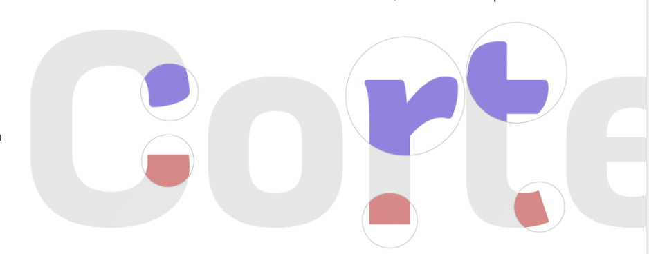
The ICT Cortex logo consists of two parts that are inseparable, but at the same time well developed even as functionally independent components. Special attention is paid to the typography itself, which is a combination of technology font and human hand. You will notice that the upper part of the Cortex print has a humanistic character, so the finer and more natural ends of the letters are written by hand, while the lower ends are geometric, more stable, and sharper. A strong contrast that is compatible shows that, although different, only together can we make changes.
The fluidity of the logo actually represents the life that is constantly in motion, changing and evolving. Let us now pay attention to the other motifs that our logo contains:
Lambda
The wavelength is marked by the Greek alphabet letter lambda. Apart from the fact that, in addition to frequency, it is a descriptive unit of waves, and thus also brain waves, it has the role of representing the mathematical, precise dimension of the logo.
“Thought”
As a decorative upper part of the letter “x,” there is a form that draws association to thought. Unlike lambda, it is a product of thinking, and therefore the starting point for creativity and ideas.
2. Flexibility of form
The flexibility of the shape creates the added value of the logo. An indefinite form that is constantly changing opens up opportunities for “intentional” forms to achieve a certain emotional reaction (seriousness, playfulness, calmness). Also, the logo dynamic indicates how as a cluster we are actually an organization ready to adapt in line with digital trends.
3. Application
The ICT Cortex logo will be animated in 80% of application cases, especially when it comes to digital channels. However, when it comes to traditional channels of communication, such as the media and the press, the logo will be static, but certainly in its well-recognized form and shape. The advantages of the animated logo are that it provides opportunities for experimenting and further creative development.
And how did it all look from the designer’s point of view?
Miloš, what are the impressions of collaborating with colleagues from Bild, and how much did you all contribute to the synergy effect and elaboration of ideas?
“Working with colleagues from the profession, from other companies is always a good opportunity for quality discussions within multidisciplinary teams. Internal company procedures and culture have a great influence on the way we work, so it is always good to have an exchange of expert opinions outside the existing environment, which can often contribute to a better end result. This was also the case here, where the designers were able to give each other constructive criticism in more iterations, to make the final proposals even better. ”
Miloš Milošević, CEO & Product Design Lead, Fleka
Ksenija, how challenging was it to create a logo like this and how did the whole collaboration with Flek go?
“Working with stains? The answer is simple – cooperation has changed the competition and improved the process. Perhaps the best side of the project is that the designers of the two houses that have been working in this field for the last 10+ years have connected, and the fun (for us, the designers) was guaranteed.
What I will definitely remember about the project and the collaboration is that at some point I tried to undermine Bild’s solution, since at that time it seemed like “wow, but how” for the given deadlines, to which the designers responded with fire. On Judgment Day in front of the Cortex team, we came out quite satisfied, presenting two diametrical solutions, which, to the satisfaction of the whole team, are signed by Davor Golubović (Bild Studio) and Vuk Bojanić (Fleka) and thus made it difficult for the client to choose. “
Ksenija Planić, Creative Director, Bild Studio
Davor, how did you come up with the idea for the animated logo, and what inspired you the most?
“The logo was created as a product of thinking about what a brand is in the digital age, the nature of the materials on which it is applied, and the perceptions of the brand through the logo. A logo as a bearer of a brand is a trademark by which the material to which it is applied is branded or, in direct translation. Traditionally, these are physical, static materials such as paper, wood, and metal. Application on screens is something that is thought about later, so for the sake of consistency, the statistics of the logo are simulated on the screens. However, the nature of the LCD screen is variable – the pixels on the screen are redrawn 60 times per second and more, and this is something I used as a building block of the sign. Basically, I tried to create a logo primarily for application on digital media, which also maintains Cortex’s goal of digitizing society.
The result is a sign in the form of a living, amorphous mass that should represent a thought that is always in some movement, evolving and changing. This opens up some new possibilities for applying and upgrading the brand through digital techniques, so the sign is not only animated but can also be interactive and in a way play the role of a mascot. ”
Davor Golubović, Graphic Designer Bild Studio
Of course, if you need to create or redesign your organization’s logo, you know which door to knock on – our colleagues from Bild and Fleka are at your disposal.
Finally, we share with you the QR code: scan, take a look and we are waiting for your impressions!